
Data Visualization
|
"Infographic thinking." This isn’t just "how to make some numbers and vector graphics look clever together." It’s a narrative language--it’s "representation plus interpretation to develop an idea,"
Francesco Franchi Why You Should Use Infographics in Education - Infographic
|
Articles
- Lesson Example with a listing of tools and data sources
- Data Visualized: More on Teaching With Infographics
- Visualizing Information for Advocacy: An Introduction to Information Design
- Teaching with Infographics: Where to Start video
- Anatomy of an Infographic: 5 steps to create a powerful visual
- Teaching With Infographics | Science and Health
- Teaching With Infographics | Language Arts, Fine Arts and Entertainment
- Teaching With Infographics | Social Studies, History, and Economics
- 5 Rules for Researching Data
- Teaching with Infographics: A Student Project Model - The ten worst man-made disasters in U.S. history a good model to use for other topics also.
- 10 Tips for Designing Infographics
- How to Create Outstanding Modern Infographics (high school and higher ed.)
- Tutorial: Create Cool Infographics (high school and higher ed.)
Data Sources
- DataMarket – Find and understand data.
- Our World in Data - Resource Link - Over 3,000 charts on topics including poverty, disease, hunger, climate change, war, existential risks, inequality, and more, with supporting research, data, and conclusions.
- Google Public Data - Filter and animate data sets from around the world. The Google Public Data Explorer makes large datasets easy to explore, visualize and communicate. As the charts and maps animate over time, the changes in the world become easier to understand. You don't have to be a data expert to navigate between different views, make your own comparisons, and share your findings.
- Google Dataset Search - Dataset Search is a search engine for datasets. Using a simple keyword search, users can discover almost 25 million datasets hosted in thousands of repositories across the Web, on nearly any subject that interests you.
- Knoema – a service that offers a huge collection of data sets and maps for public use. video overview Recently, Knoema introduced a Chrome extension called World Data Finder. World Data Finder will correlate information from Knoema's data sets and maps to articles that you read online.
- Currated List of Data Sources
- Create Your Own USGS Maps Besides the galleries of free to use and re-use media that the USGS hosts. The USGS National Map Viewer. is more than just a place to look at a map. The USGS National Map Viewer lets you choose from a huge library of datasets to display on a map. You can view the source information for each dataset. Additionally, you can choose the base map on which the datasets are displayed. If that's not enough to get you to try the USGS National Map Viewer, I should also tell you that you can draw on the maps, measure on the maps, and print your customized map displays. Watch this short video
- Knoema is a huge collection of data sets and maps for public use. Knoema offers data maps and charts for almost every country in the world. There are dozens of data categories to pick from. Some of the data categories that you will find include GPD Per Capita, Government Debt, Migration, Housing, Energy Consumption, and Agricultural Production. To find a data map or chart on Knoema to use with your students first select a data set then choose a country from the drop-down menu tied to each data set. Each data set, map, and chart can be exported downloaded and or embedded into a blog post or webpage.
- The Data Hub – The easy way to get, use and share data.
- The Global Economy.com is a nice resource developed for high school and undergraduate students. It provides guides to understanding the economies of individual countries and the global economy in aggregate. It offers a database of articles about the economies of individual countries. You can select any country from the list of more than 200 to find basic economic indicators about that country. The country profiles include not just the data associated with economic indicators, but also explanations of the indicators, and graphs of the data in comparison with other countries. For visual comparisons of economic indicator data There is an easy-to-use comparison tool. On the comparison page you can select a set of data and the countries that you want to compare. The comparison is then shown in the form of a graph.
- View Data Sources by Topic
- City Data is a free directory of statistics about US Cities. The type of data sets that you will find on City Data includes all the typical information you'd expect to find like housing prices, demographic data, and job data. City Data also provides information about things like cell phone coverage, quality and availability of public transportation, and air quality. The data is arranged in list form, in graph, and chart form. Beyond the statistics available on City Data, all of which you could find on other websites, there is a great discussion board.
- Data.Census.gov you can find, read, and analyze data sets. Beyond that you can filter data sets and even create custom maps of the data sets. I lost at least an hour of my day messing about with the mapping tool. Watch this short video
- Social Explorer provides easy access to census demographics about the United States from 1940 to 2000. The free public edition offers a collection of interactive demographic maps of census data that can be viewed, queried, and manipulated. Students can visually analyze and understand the demography of the U.S., their regions, and their neighborhoods, creating their own queries and parameters.Tools include zoom-in capability, selection of variables, the option to create a slideshow enabling comparative dataset mapping, and printing.
- World Bank Data – The world at a glance (key development indicators).
- IMF's Data Mapper If you're in need of a good visual representation of the World's economic outlook, check out the IMF's Data Mapper. The IMF Data Mapper allows you to see the current, past, and predicted distribution of wealth around the world. Use the slider tabs on the IMF Data Mapper to change the map's display.
- Gapminder - Displays time series of development statistics for all countries.
- Listly This is a free tool to turn web data into Excel. All you need is just one-click. It automatically extracts clean data and arranges them into rows and columns.’
- Patchwork Nation makes open data easy. It delivers national data with local context while remaining visually intuitive for the reader. The interactive map helps break down national data to analyze how it impacts communities. We put data in the hands of the user, allowing him or her to compare different data sets and explore national data county-by-county.
- The US Census Bureau conducts a wide range of surveys and research that spans far beyond the tallying of people and their basic demographics. With a newly redesigned website, the bureau makes it easy for users to find information they need and highlights a number of useful tools and visualizations. For example, in addition to basic data on enrollment and attainment, the education page has data from several surveys compiled into an infographic, “Education Funding: Where Do Schools Get Their Money? How Do They Spend It?” The site also shines with its selection of interactive tools and databases, ranging from simple games such asPopulation Bracketology, which asks users to choose which cities have more people, to vivid tools such asCensus Explorer, which lets users s can the country block by block and view color-coded data on age, education, income and more. Census.gov serves both as a reference tool for students and as a source of fascinating, interactive data ripe for use in classrooms.
Click Here to Visit Education Web Page
Click Here to Download Free Infographic
Click Here to Access Free Game - The Eviction Lab It’s an interactive map that can give you a detailed report (even by Census Tract!) about history of evictions taking place in what looks like any community in the U.S.You can also read more about it in this New York Times article, In 83 Million Eviction Records, a Sweeping and Intimate New Look at Housing in America.It will be an indispensable tool for any class that is analyzing/comparing neighborhoods. A Lesson Highlighting Community Assets — Not Deficits.
- Timelapse is an incredible visual satellite timeline powered by Google. Timelapse is about as close as you can get to a time machine, if that time machine hovered above the earth and gave you a bird’s eye view of development and change. Students can choose from some highlighted Timelapse views including: Las Vegas, Dubai, Shanghai, Oil Sands, Mendenhall Glacier, Wyoming Coal, Columbia Glacier, and Lake Urmia. Alternatively, students can use the search box to view a satellite timelapse of any place in the world. Students can change the speed of the timelapse, pause the satellite imagery, and zoom in or zoom out. The imagery begins in 1984 and goes through 2012. Timelapse The site itself sparks lots of questions. Depending on the location, students may inquire into climate change, history, development, expansion, human impact on land, satellites, etc. Timelapse could also be used in science classes and history classes. This is a great tool for students to use to analyze and evaluate visual data.
- Statistics in Schools program for K-12 teachers and students from the US Census Bureau. Using current and historical data, the Census Bureau provides teachers the tools to help students understand statistical concepts and improve their data analysis skills. The program offers free online activities and other resources in geography, history, and sociology.
- Data USA. MIT Media Lab, in partnership with Deloitte and the data visualization startup Datawheel, has just gone live with perhaps the most extensive tool ever created for mining and visualizing US government open data, called Data USA. Easy to navigate and visualize data
- The GTG Visualization Tool is an interactive global data mapping of hundreds of organizations that support the education, health, well-being, and success of young women and girls globally. Users can select a country or service area and see a list of organizations serving that geographic location, as well as the services they provide and their websites. Currently, the Visualization Tool includes information for 286 organizations. Find the GTG Collaborative Visualization Tool here.
- Patchwork Nation makes open data easy. It delivers national data with local context while remaining visually intuitive for the reader. The interactive map helps break down national data to analyze how it impacts communities. We put data in the hands of the user, allowing him or her to compare different data sets and explore national data county-by-county.
- WorldMap – Explore, visualize and publish geographic information.
- Zip Lookup The map allows you to enter any US zip code to discover demographic data about that area.
- US Census Bureau – Measures America (people, places, economy). see below
- Maps & Data section of the U.S. Census Bureau's website is a good place to find that data in a visual format. In the Maps & Data section of the U.S. Census Bureau's website you can explore thematic maps about the population of the United States.
Applications for Education Census data can tell us a lot about the United States. Comparing census data sets over time can tell us a lot about how the United States has changed through the years. Seeing those changes can be challenging to students when all they have is a data table. Mapped representations the data can make it easier to recognize patterns and make meaning from census data sets. After looking at the maps ask students to investigate - Data360 – Telling compelling and data-driven stories.
- Number Of – You ask, they count.
- Gallup – Public opinion polls.
- World Data Finder – is a one-click assistant for a fast data discovery and data analysis.
- Get the Data – Ask and answer data questions.
- Influence Explorer – Provides overviews of political influence data for politicians.\
- datacatalogs.org – A comprehensive list of open data catalogs.
- Freebase – An entity graph of people, places and things from Google.
- EveryBlock – Uncovers info on large cities contained in government databases.1
- Daytum – Helps you collect, organize and communicate your everyday data.
- Munterbund - Graphical visualization of text similarities in essays.
What’s the difference between data visualization and infographics?
Data visualizations are certain types of visuals that help us see and understand data,
ideally in ways that lead us to have quick insights and “aha”s.
Data visualizations are certain types of visuals that help us see and understand data,
ideally in ways that lead us to have quick insights and “aha”s.
Common examples of data visualizations: Bar graphs Timelines Line graphs Pie chart Scatterplots diagrams Maps
They can stand alone but we often find them in reports, white papers, brochures, posters, presentations and infographics.
Infographics, short for informational graphics, are design products or ways to share information in a form that is highly visual.
Infographics usually tell a story of some kind, and they can be short and simple or long and in-depth. They can include a variety of elements such as narratives, illustrations, icons, photos, and data visualizations.
Evaluating Infographic
What INFOGRAPHIC EXEMPLARS can you find and recommend?
Work with a partner or small group to explore the infographic sites and examples below.
Work with a partner or small group to explore the infographic sites and examples below.
Use the Questions below to guide your thinking and discussion:
- Look at the examples and identify what you like/don't like about each one.
- What is the infographic about? What story is being told?
- How are colors used differently in each one? Are some colors more powerful than others?
- How are objects displayed on each one? Do sizes of the objects matter in showing the intended information?
- How could colors, sizes, and kinds of objects be used to mislead people away from the data?
- How do the words support or distract from the message?
- Make notes about what you notice and like/don't like about the infographics. Your students will be creating some throughout the year and these notes will remind you of what you visually like to see and will serve as a starting point for you.
Infographic Design Toolkit
Rubric for Infographihc Use in the Classroom
Beginners Guide to Infographics Before clicking on download scroll down for formHow to Design an Infographic Video
General Lesson Plan template
The Do’s and Dont's of Infographic Design
Tips to Create Engaging Infographics with Your Class
Showing Evidence Tool by Intel The tool provides a visual framework to make claims, identify evidence, evaluate the quality of that evidence, explain how the evidence supports or weakens claims, and reach conclusions based on the evidence.
Visual Ranking Tool by Intel The Visual Ranking Tool makes the process of ranking items and comparing lists easy. With a simple click and drag, students move items to any position in a list. Working in teams, they collaborate and negotiate their reasoning. The comment feature of the tool gives them a place to record this rationale.
Seeing Reason Tool by Intel With the Seeing Reason Tool students create visual maps of the factors and relationships in a cause-and-effect investigation.
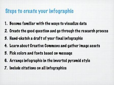
Anatomy of an Infographic: 5 steps to create a powerful visual Online Tutorials
Block Posters is a web-based tool to which you can upload a high quality graphic then divide it into letter-sized chunks for printing. Print out each section and put them together on a poster board to make your own poster. Infographics that could be great posters to hang in a classroom if only there was an easy way to print them poster-sized. Most teachers don't have ready access to printers that can handle poster-sized paper, but do have access to standard letter-size printers.
Beginners Guide to Infographics Before clicking on download scroll down for formHow to Design an Infographic Video
General Lesson Plan template
The Do’s and Dont's of Infographic Design
Tips to Create Engaging Infographics with Your Class
Showing Evidence Tool by Intel The tool provides a visual framework to make claims, identify evidence, evaluate the quality of that evidence, explain how the evidence supports or weakens claims, and reach conclusions based on the evidence.
Visual Ranking Tool by Intel The Visual Ranking Tool makes the process of ranking items and comparing lists easy. With a simple click and drag, students move items to any position in a list. Working in teams, they collaborate and negotiate their reasoning. The comment feature of the tool gives them a place to record this rationale.
Seeing Reason Tool by Intel With the Seeing Reason Tool students create visual maps of the factors and relationships in a cause-and-effect investigation.
Anatomy of an Infographic: 5 steps to create a powerful visual Online Tutorials
- How to Create Outstanding Infographics
- 5 Steps to Create a Powerful Visual
- How to Create Infographics
- SIMILE Widgets
- Infographics Design Framework
- Creating Infographics Screencast Tutorial Easel.ly, where you can use one of their templates to create your infographic. sThe tutorial steps you through changing objects, object size and color, and adding text. Then the tutorial switches to Infogr.am, reviewed here, and shows how to either use their templates, or create your own, including importing your own data and images.
- Online Tutorials and Lesson Plans
Block Posters is a web-based tool to which you can upload a high quality graphic then divide it into letter-sized chunks for printing. Print out each section and put them together on a poster board to make your own poster. Infographics that could be great posters to hang in a classroom if only there was an easy way to print them poster-sized. Most teachers don't have ready access to printers that can handle poster-sized paper, but do have access to standard letter-size printers.
Before deciding on which infographic to use, look at the sites below
Which Type of Infographic Should You Use?
8 Types of Infographics Teachers Should Know About
click on each example to enlarge
Which Type of Infographic Should You Use?
8 Types of Infographics Teachers Should Know About
click on each example to enlarge
What’s Going On in this Graph? The feature will utilizes The Times’s rich trove of graphic visualizations—graphs, maps, and charts. Starting on September 19, 2017, and thereafter on the second Tuesday of every month from October to May, The Learning Network will publish a Times graphic on a topic suitable for subjects across the curriculum. The content and statistical concepts will be appropriate for most students in grades 7–12. he Learning Network will publish a Times graphic on a topic suitable for subjects across the curriiculum. The statistical concepts will be appropriate for most students in grades 7 - 12.
Tools and Guides to Create infographics
Graphic Tools
Infographic Creation Strategies for the Art-Challenged
Grafico is an easy to use infographic and smart visuals maker that allows you to create designs in seconds. Graficto has hundreds of professionally designed infographic templates for lists, processes, cycles, or even charts. All you have to do is select the template you like and start adding content.
Drawify lets you use AI to create infographics and other visuals.
Visme Visme Guides Visme guide for editing an existing template
Visual Schedules - best for younger students.
Inkscape is a free vector graphic software available for many platforms. This is the ideal free option for the creation of your overall infographic. Simple and intuitive, you should have no problems importing your visualizations and combining them with other visuals to create your masterpiece.
Piktochart infographics creator $ Piktochart has free and premium options. With the free version, there are seven free infographic templates. Each template can be customized by changing the colors, fonts, icons, and charts on each template. Visual Guide | 7 Video Tutorials to Help You Create Classroom Posters and Infographics Using Piktochart
Canva Templates for Infographics Infographics are harder to create than you might think. It takes a lot of processing to decide how best to organize your data and tell the story you want to tell. However, when done well, they are a very effective way of communicating complex data. Canva has a good selection of infographic templates that you can use for inspiration, but they also have many more elements you can use in the editor.
Gapminder (Tutorial video ) A tool that allows the user to present a huge amount of world data visually, in moving, interactive graphs. video presention at TED Gapminder has a page for educators on which they can find thematic animations, graphs, quizzes, model lessons, and a PDF guide to using Gapminder. For teachers working in schools with slow Internet connections or very strict filtering, Gapminder has a desktop application that you can download and install for Mac or Windows computers. This video demonstrates Gapminder desktop.
Many Eyes Data visualization tool provides the structure to present data 16 different ways. Helps to discover correlations between data sets. How to use video
Easel.ly is a tool for creating infographics. Easel.ly provides a canvas on which you can build your own infographic by dragging and dropping pre-made design elements. You can use a blank canvas or build upon one of Easel.ly's themes. If Easel.ly doesn't have enough pre-made elements for you, you can upload your own graphics to include in your infographic. Your completed infographic can be exported and saved as PNG, JPG, PDG, and SVG files. Watch the video below for an overview of Easel.ly. Tutorial video
Visual.ly Not only a good resource for finding infographics, but it now offers a create your own option
Venngage is a new site that is ideal for creating infographics.
Zanifesto is a free infographic creation tool that is good for elementary age students. Well stocked with graphics and easy to use chart maker
5 Simple Tools for Creating Infographics Ideas using, maps, Venn diagrams, word clouds, graphic organizers, and periodic tables
Graphics Editing Programs that can be Used for Creating Infographics from a blank Page
to add photos, text, and videos. You can even create an interactive album by linking to
other images.
StorylineJS makes it easy to tell the story behind a dataset, without the need for programming or data visualization expertise. Just upload your data to Google Sheets, add two columns, and fill in the story on the rows you want to highlight. Set a few configuration options and you have an annotated chart, ready to embed on your website
5 Simple Tools for Creating Infographics Ideas using, maps, Venn diagrams, word clouds, graphic organizers, and periodic tables
Silk.co' Quick and easy tool for creating data visualizationss updated tools for creating data visualizations. you can upload data in a spreadsheet, manually enter data, or use one of data sets that Silk provides in their gallery. Once you've uploaded data or selected it you can use it to create fourteen different visualizations. video tutorial
Create an infographic from social media sites
Graph Themed Infographics
Mind the Graph create science-themed infographics
Data Gif Maker make basic data GIFs today. While the Data GIF Maker is mostly geared toward journalists, anybody can use it to make some halfway interesting visuals based on all kinds of data. This isn’t some GIF-centric version of the Google Data Studio. Instead, you can use it only to compare stats about two different topics over time
aiSee reads a textual graph specification and automatically calculates a customizable graph layout. This layout is then displayed, and can be interactively explored, printed and exported to various graphic formats.
Map Themed Infographics
Map a List turns Google Spreadsheet information into Google Maps placemarks. The finished product is a Google Map of the information you've selected from your Google Spreadsheets. To create a map from your spreadsheets you need to register for a Map a List account and give it access to your Google Docs account. Map a List then walks you through each step of selecting a spreadsheet, defining the parameters for your map, and choosing placemarks. Just like in Google Maps you can customize the placemark icons that are used in your Map a List displays. Your maps can be shared publicly or privately. Your maps can be downloaded as KML files to use in Google Earth.
StatWorld contains more than 400 world maps of data on topics in economics, education, health, environment, the digital divide, and much more. You can explore the maps by selecting a data set and then a display format. You can also choose to display the data for all countries or only the countries that you wish to compare. Applications for Education StatWorld could be a good tool to have students use to compare the economic development of countries and regions. Have students compare data sets from multiple categories and ask them to try to develop cause and effect relationships between the data sets. For example, can they find a connection between the duration of compulsory education and GDP per capita?
GeoCommons provides excellent tools for creating and sharing map-based data visualizations. Users can select a from twelve base maps to build upon. Use GeoCommons to create visualizations in which they attempt to show correlations between physical geography datasets and human geography datasets.After choosing a base map users can select from more than 49,000 public data sets or upload their own data sets. Map creators can add more than one data set to their maps. To complete the visualizations users can specify colors, shades, shapes, and apply numerous filters to determine what is or is not displayed from their chosen data sets. Completed maps can be shared as KML files or embedded into blogs and websites. These two videos provide an introduction to creating maps with GeoCommons. video 1 | video 2
BatchGoo Fast way to create google maps from your data. It accepts addresses, intersections, cities, states, and postal codes. We do the hard work of figuring out where all your data lives in the real world. You can sort the placemarks on the maps, e.g., perhaps you want only to show cities by population. Can upload easily to a Website also. video
Heat Map Tool is an online service for creating mapped representations of your data. A heat map allows you to quickly visualize spatial data using a range of colors, and when combined with the power of the Google Maps API, visualizing location information has never been easier
Google Maps Mania Terrific site for finding maps that zero in on economic and political issues, e.g., states and countries poverty levels or worldwide slavery.
Animaps is a service that was built for the purpose of allowing users to create animated Google Maps. The basics of creating maps in Animaps is very similar the process for creating maps in Google Maps. The main benefit of using Animaps over Google Maps is that you can create a tour of your placemarks that plays through according to the timing that you specify. Another benefit is that you can build in colored shapes to expand and contract to demonstrate patterns. You can also import images to your map from Flickr, Picassa, and Facebook.
StatSilk Search for interactive maps that compare economic, social and human development and create your own maps
StatWorld Contains more than 400 world maps of data on topics in economics, education, health, environment, the digital divide, and much more. You can explore the maps by selecting a data set and then a display format. You can also choose to display the data for all countries or only the countries that you wish to compare. Applications for Education StatWorld could be a good tool to have students use to compare the economic development of countries and regions. Have students compare data sets from multiple categories and ask them to try to develop cause and effect relationships between the data sets. For example, can they find a connection between the duration of compulsory education and GDP per capita?
UUorld - AMAZING! Immersive mapping environment, high-quality data, and critical analysis tools. Explain the world in maps. Depict data geographically and over time. WATCH the intro. video at the site.
Vidmap, lets users create maps that work in tandem with online video, displaying the location that appears in the video on an adjacent dynamic map.
The process to create a map is surprisingly easy: upload a video to Vidmap or use one already hosted on YouTube and click the map to create drag and drop markers. The result is a map that has an added layer of dimensionality and visual interest.
Spotzi Website Spotzi is a world map reflecting different themes such as Agriculture, Climatology, Meteorology, Business, Health & Diseases, Transport and Communication, Environment and Conservation, Military, Geology and Biology
UMapper Quickly create, edit and annotate maps with this web based tool. Mapping services to choose from include: Bing, Google, Yahoo and Openstreet. Maps can be tagged, routes created, and media embedded within the map (audio & image). Once a map is complete it can be shared or embedded
IndieMapper Make thematic maps from geographic data
World Map developed by the Center for Geographic Analysis at Harvard University. You can build some great mapped data visualizations on the service You can use the more than 1800 data sets that are stored in the service or you can upload your own data sets. The majority of the data sets in the World Map library have abstracts explaining a bit about the purpose and scope of the data. There are five default base maps that you can choose to build upon. Alternatively, you can choose to create your map completely from scratch and upload your own base layer to build upon. Maps that you create on World Map can be embedded into a website, printed, or viewed in Google Earth. Watch Video
ikiMap is a free service for creating custom maps online. The service allows you to build custom maps on top of Google Maps, Bing Maps, and Open Street Maps. You can also use a completely blank canvas and upload a map. The maps that you create on ikiMap can be shared publicly or privately. Your maps can be constructed collaboratively on ikiMap.
To create a custom map on ikiMap you do have to register on the site and confirm your registration in an email. Each placemark you add can contain text, images, links, and embedded videos. ikiMap provides easy-to-use tools for drawing shapes. Upload feature to import data sets and KML files. You can download your maps from ikiMap as KML files to use in other applications. An online alternative to Google Maps that offers a little more in terms of customization features.
Target Map is a service that allows anyone to create mapped displays of data sets. Users of Target Map can importa and map their own data sets, use data sets from other users, use data sets found online, or manually input data onto a map.
MappingWorlds the site offers users a new way to look at the world by resizing countries on the map in relation to a series of global issues.
Thematic Mapping Engine provides users with a very simple way to create Google Earth kmz files. Thematic Mapping draws on data provided by the United Nations to create maps depicting all types of development data and environmental science data. Users select a statistical indicator category, select a year or range of years, and the manner in which they would like the data displayed in Google Earth. If you're using a Windows computer you can preview your files before downloading them.
UN Stat Planet Map allows you to create useful mapped displays of UN development indicators data. There are ten data categories from which you can choose. Within each category there are further refinements possible. You can customize the map to present sharper contrasts between the data indicators, change the indicator symbols, and alter the map legend. To visual the change in data over time, use the time slider at the bottom of the map. Your maps and the data that they represent can be downloaded as PNG and JPEG files for printing.
MapStory is a free tool for creating mapped displays of data sets. Data sets that are time based, the travels of Genghis Khan for example, can be set to play out in a timeline style on your map. Creating a MapStory might look complicated at first glance, but it's actually quite easy to create a map. To get started select a data set or sets that you want to display on your map. You can choose data sets from the MapStory gallery or upload your own. The notes option in MapStory lets you create individual events to add to your map and timeline. Lines and polygons can also be added to your projects through the notes feature in MapStory.
MDG Maps Could be a useful tool for students of georgarphy, political science and global economics. Data maps are good for providing students with a ameans to visually compare data sets. I can see MDG as being a resource for students to quickly compare development indicators of countries in a regions or continent. Use the comparisons students make as the jumping-off point for research into the causes and solutions of development inequalities between countries
Worldmapper: The world as you've never seen it before
A collection of world maps. where territories are re-sized on each map according to the subject of interest. There are nearly 600 maps. Maps 1- 366 are also available as PDF posters World Mapper offers a unique way to look at data sets. World Mapper hosts a large collection of over maps displaying all types of scientific, economic, historical, and demographic data. World Mapper uses density-equalizing maps to display each country and continent differently based on each data set. For example the birthrate map displays countries with a higher birthrates as larger than normal (standard projection) when compared to countries with a lower birthrate which displayed smaller than normal.
World Mapper makes hundreds of the maps available PDF files that can be used to create posters for your classroom (click here for a land area map). World Mapper also makes available, as pdf files, the data sets used in the creation of each map.
Mapmaker interactive at national geographic site
The UN Stat Planet Map allows you to create useful mapped displays of UN development indicators data. There are ten data categories from which you can choose. Within each category there are further refinements possible. You can customize the map to present sharper contrasts between the data indicators, change the indicator symbols, and alter the map legend. To visual the change in data over time, use the time slider at the bottom of the map. Your maps and the data that they represent can be downloaded as PNG and JPEG files for printing.
GeoCommons provides excellent tools for creating and sharing map-based data visualizations. Users can select a from twelve base maps to build upon. After choosing a base map users can select from more than 49,000 public data sets or upload their own data sets. Map creators can add more than one data set to their maps.
Scribble Maps Edit and make notations on Google Maps with this web based mapping tool. Features include: text, image & markers. Final product can be saved and shared with an embed code.
Umapper UMapper is a mapping tool for educators. It allows its users to create and manage interactive maps and geogames online. These maps can be shared with others or be embedded in blogs and websites
MapTiler This a tool that allows users to create overlay of standard maps like Google Maps, and Yahoo Maps and can also be visualized in 3D form.
Build A Map This is another cool tool for teachers to create maps. Build A Map is powered by Google Maps and provides a wide range of tools to easily build interactive online maps.
World Map This one here is being developed by Center for Geographic Analysis at Harvard University and allows users to easily build their own mapping portal and publish it to the world or to just a few collaborators.
GeoCommons Maker! "Professional cartography is now in your hands. Maker! was designed by cartographers with an eye for detail. Style your map with shaded thematics, proportional symbols, and more. Maker! makes the tough statistical and cartographic decisions for you. Anyone can build complex, data-rich maps."
Map Faire This is a cool tool for teachers to create awesome maps and share them with their students. Map Faire has a simple and student friendly interface and is very easy to use.
Target Map is a new service that allows anyone to create mapped displays of data sets. Users of Target Map can importa and map their own data sets, use data sets from other users, use data sets found online, or manually input data onto a map.
If It Were My Home A Google Map tool that allows you to compare the size of the BP Oil Spill to your community. If It Were My HomeIf It Were My Home will also show you a size comparison of a selected country centered over your hometown. now offers a feature for quickly comparing ten key statistics about life in different countries. To view the comparisons just select two countries from the lists and click compare.
ChartsBin create mapped data visualizations. It's also a place to find data visualizations created and shared by others. The gallery of data visualizations include categories for education data, environmental data, and lots of economic data. All of the visualizations in ChartsBin can be embedded into blog posts and webpages. To create your own visualizations on ChartsBin you do have to provide your own data sets. You can upload data sets that you have stored on your computer. Once your data is uploaded you can customize the visualization of your data. The video offers a short overview of the process (the video does not have sound).
UN Stat Planet Map allows you to create useful mapped displays of UN development indicators data. There are ten data categories from which you can choose. Within each category there are further refinements possible. You can customize the map to present sharper contrasts between the data indicators, change the indicator symbols, and alter the map legend. To visual the change in data over time, use the time slider at the bottom of the map. Your maps and the data that they represent can be downloaded as PNG and JPEG files for printing.
Surging Seas, produced by ClimateCentral.org, is an interactive map of the potential impact on the United States of rising sea levels. The map allows you to click along coastal areas on the east coast and west coast to see how high the sea level could rise. The Surging Seas maps also project the number of people, homes, and land area that could be affected if the projections are correct.
StatPlanet This one here allows users to create map visualizations and share them with others. It can be used either within a browser or download the software.
Venn
Hohli is an easy-to-use free online application that lets you create venn diagrams in just a few seconds.
Make Sweet is a fun free online tool that allows you to quickly create a neat-looking 3D venn diagram consisting of two circles. The best part of it is that you can also create fun image based venn diagrams for a more popular visual effect
Spreadsheet Integration
- Infographic Templates
- The Top 9 Infographic Template Types and template gallery
- 15 Free Infographic Design Kits download
- Free Infographic Creator Kit for PC
- How to Make Color Selections & Color Palette
- See Photo Gallery of #ClassyGraphics from Tony Vincent
- more Templates
- Many Eyes Data visualization tool provides the structure to present data 16 different ways. Helps to discover correlations between data sets. How to use video
- Google Drawing, Google Slides formatted infographic Templates
- Thinglink Make Your Images Interactive Give photos new life with sound, voice, video, social, and other fun links. Upload image and put tags parts of image to other sites or docs How to Embed Interactive ThingLink Images Into Blog or Website 65 Ways to Use ThingLink
- Stipple is a new service that allows you to create interactive images. The service launched in closed beta during the summer. Since the summer Stipple has left beta and has added a free iPhone app for creating interactive images on the go. Using Stipple you can upload an image and tag it with pinmarks. Within each pinmark you can include videos, links, text, audio files, and more images. Stipple also gives you the option to track where your images are viewed and shared by others. video
- SlideRocket infographic templates Includes interactive and animated templates
Grafico is an easy to use infographic and smart visuals maker that allows you to create designs in seconds. Graficto has hundreds of professionally designed infographic templates for lists, processes, cycles, or even charts. All you have to do is select the template you like and start adding content.
Drawify lets you use AI to create infographics and other visuals.
Visme Visme Guides Visme guide for editing an existing template
Visual Schedules - best for younger students.
Inkscape is a free vector graphic software available for many platforms. This is the ideal free option for the creation of your overall infographic. Simple and intuitive, you should have no problems importing your visualizations and combining them with other visuals to create your masterpiece.
Piktochart infographics creator $ Piktochart has free and premium options. With the free version, there are seven free infographic templates. Each template can be customized by changing the colors, fonts, icons, and charts on each template. Visual Guide | 7 Video Tutorials to Help You Create Classroom Posters and Infographics Using Piktochart
Canva Templates for Infographics Infographics are harder to create than you might think. It takes a lot of processing to decide how best to organize your data and tell the story you want to tell. However, when done well, they are a very effective way of communicating complex data. Canva has a good selection of infographic templates that you can use for inspiration, but they also have many more elements you can use in the editor.
Gapminder (Tutorial video ) A tool that allows the user to present a huge amount of world data visually, in moving, interactive graphs. video presention at TED Gapminder has a page for educators on which they can find thematic animations, graphs, quizzes, model lessons, and a PDF guide to using Gapminder. For teachers working in schools with slow Internet connections or very strict filtering, Gapminder has a desktop application that you can download and install for Mac or Windows computers. This video demonstrates Gapminder desktop.
Many Eyes Data visualization tool provides the structure to present data 16 different ways. Helps to discover correlations between data sets. How to use video
Easel.ly is a tool for creating infographics. Easel.ly provides a canvas on which you can build your own infographic by dragging and dropping pre-made design elements. You can use a blank canvas or build upon one of Easel.ly's themes. If Easel.ly doesn't have enough pre-made elements for you, you can upload your own graphics to include in your infographic. Your completed infographic can be exported and saved as PNG, JPG, PDG, and SVG files. Watch the video below for an overview of Easel.ly. Tutorial video
Visual.ly Not only a good resource for finding infographics, but it now offers a create your own option
Venngage is a new site that is ideal for creating infographics.
Zanifesto is a free infographic creation tool that is good for elementary age students. Well stocked with graphics and easy to use chart maker
5 Simple Tools for Creating Infographics Ideas using, maps, Venn diagrams, word clouds, graphic organizers, and periodic tables
Graphics Editing Programs that can be Used for Creating Infographics from a blank Page
- Splashup
- Sumo Paint
- Inkspace It has a simple and intuitive interface and besides being able to create your own inforgraphics, it also allows you to import your visualisations and combine them with other visuals to create your own. ( It requires download )
to add photos, text, and videos. You can even create an interactive album by linking to
other images.
StorylineJS makes it easy to tell the story behind a dataset, without the need for programming or data visualization expertise. Just upload your data to Google Sheets, add two columns, and fill in the story on the rows you want to highlight. Set a few configuration options and you have an annotated chart, ready to embed on your website
5 Simple Tools for Creating Infographics Ideas using, maps, Venn diagrams, word clouds, graphic organizers, and periodic tables
Silk.co' Quick and easy tool for creating data visualizationss updated tools for creating data visualizations. you can upload data in a spreadsheet, manually enter data, or use one of data sets that Silk provides in their gallery. Once you've uploaded data or selected it you can use it to create fourteen different visualizations. video tutorial
Create an infographic from social media sites
Graph Themed Infographics
Mind the Graph create science-themed infographics
Data Gif Maker make basic data GIFs today. While the Data GIF Maker is mostly geared toward journalists, anybody can use it to make some halfway interesting visuals based on all kinds of data. This isn’t some GIF-centric version of the Google Data Studio. Instead, you can use it only to compare stats about two different topics over time
aiSee reads a textual graph specification and automatically calculates a customizable graph layout. This layout is then displayed, and can be interactively explored, printed and exported to various graphic formats.
Map Themed Infographics
Map a List turns Google Spreadsheet information into Google Maps placemarks. The finished product is a Google Map of the information you've selected from your Google Spreadsheets. To create a map from your spreadsheets you need to register for a Map a List account and give it access to your Google Docs account. Map a List then walks you through each step of selecting a spreadsheet, defining the parameters for your map, and choosing placemarks. Just like in Google Maps you can customize the placemark icons that are used in your Map a List displays. Your maps can be shared publicly or privately. Your maps can be downloaded as KML files to use in Google Earth.
StatWorld contains more than 400 world maps of data on topics in economics, education, health, environment, the digital divide, and much more. You can explore the maps by selecting a data set and then a display format. You can also choose to display the data for all countries or only the countries that you wish to compare. Applications for Education StatWorld could be a good tool to have students use to compare the economic development of countries and regions. Have students compare data sets from multiple categories and ask them to try to develop cause and effect relationships between the data sets. For example, can they find a connection between the duration of compulsory education and GDP per capita?
GeoCommons provides excellent tools for creating and sharing map-based data visualizations. Users can select a from twelve base maps to build upon. Use GeoCommons to create visualizations in which they attempt to show correlations between physical geography datasets and human geography datasets.After choosing a base map users can select from more than 49,000 public data sets or upload their own data sets. Map creators can add more than one data set to their maps. To complete the visualizations users can specify colors, shades, shapes, and apply numerous filters to determine what is or is not displayed from their chosen data sets. Completed maps can be shared as KML files or embedded into blogs and websites. These two videos provide an introduction to creating maps with GeoCommons. video 1 | video 2
BatchGoo Fast way to create google maps from your data. It accepts addresses, intersections, cities, states, and postal codes. We do the hard work of figuring out where all your data lives in the real world. You can sort the placemarks on the maps, e.g., perhaps you want only to show cities by population. Can upload easily to a Website also. video
Heat Map Tool is an online service for creating mapped representations of your data. A heat map allows you to quickly visualize spatial data using a range of colors, and when combined with the power of the Google Maps API, visualizing location information has never been easier
Google Maps Mania Terrific site for finding maps that zero in on economic and political issues, e.g., states and countries poverty levels or worldwide slavery.
Animaps is a service that was built for the purpose of allowing users to create animated Google Maps. The basics of creating maps in Animaps is very similar the process for creating maps in Google Maps. The main benefit of using Animaps over Google Maps is that you can create a tour of your placemarks that plays through according to the timing that you specify. Another benefit is that you can build in colored shapes to expand and contract to demonstrate patterns. You can also import images to your map from Flickr, Picassa, and Facebook.
StatSilk Search for interactive maps that compare economic, social and human development and create your own maps
StatWorld Contains more than 400 world maps of data on topics in economics, education, health, environment, the digital divide, and much more. You can explore the maps by selecting a data set and then a display format. You can also choose to display the data for all countries or only the countries that you wish to compare. Applications for Education StatWorld could be a good tool to have students use to compare the economic development of countries and regions. Have students compare data sets from multiple categories and ask them to try to develop cause and effect relationships between the data sets. For example, can they find a connection between the duration of compulsory education and GDP per capita?
UUorld - AMAZING! Immersive mapping environment, high-quality data, and critical analysis tools. Explain the world in maps. Depict data geographically and over time. WATCH the intro. video at the site.
Vidmap, lets users create maps that work in tandem with online video, displaying the location that appears in the video on an adjacent dynamic map.
The process to create a map is surprisingly easy: upload a video to Vidmap or use one already hosted on YouTube and click the map to create drag and drop markers. The result is a map that has an added layer of dimensionality and visual interest.
Spotzi Website Spotzi is a world map reflecting different themes such as Agriculture, Climatology, Meteorology, Business, Health & Diseases, Transport and Communication, Environment and Conservation, Military, Geology and Biology
UMapper Quickly create, edit and annotate maps with this web based tool. Mapping services to choose from include: Bing, Google, Yahoo and Openstreet. Maps can be tagged, routes created, and media embedded within the map (audio & image). Once a map is complete it can be shared or embedded
IndieMapper Make thematic maps from geographic data
World Map developed by the Center for Geographic Analysis at Harvard University. You can build some great mapped data visualizations on the service You can use the more than 1800 data sets that are stored in the service or you can upload your own data sets. The majority of the data sets in the World Map library have abstracts explaining a bit about the purpose and scope of the data. There are five default base maps that you can choose to build upon. Alternatively, you can choose to create your map completely from scratch and upload your own base layer to build upon. Maps that you create on World Map can be embedded into a website, printed, or viewed in Google Earth. Watch Video
ikiMap is a free service for creating custom maps online. The service allows you to build custom maps on top of Google Maps, Bing Maps, and Open Street Maps. You can also use a completely blank canvas and upload a map. The maps that you create on ikiMap can be shared publicly or privately. Your maps can be constructed collaboratively on ikiMap.
To create a custom map on ikiMap you do have to register on the site and confirm your registration in an email. Each placemark you add can contain text, images, links, and embedded videos. ikiMap provides easy-to-use tools for drawing shapes. Upload feature to import data sets and KML files. You can download your maps from ikiMap as KML files to use in other applications. An online alternative to Google Maps that offers a little more in terms of customization features.
Target Map is a service that allows anyone to create mapped displays of data sets. Users of Target Map can importa and map their own data sets, use data sets from other users, use data sets found online, or manually input data onto a map.
MappingWorlds the site offers users a new way to look at the world by resizing countries on the map in relation to a series of global issues.
Thematic Mapping Engine provides users with a very simple way to create Google Earth kmz files. Thematic Mapping draws on data provided by the United Nations to create maps depicting all types of development data and environmental science data. Users select a statistical indicator category, select a year or range of years, and the manner in which they would like the data displayed in Google Earth. If you're using a Windows computer you can preview your files before downloading them.
UN Stat Planet Map allows you to create useful mapped displays of UN development indicators data. There are ten data categories from which you can choose. Within each category there are further refinements possible. You can customize the map to present sharper contrasts between the data indicators, change the indicator symbols, and alter the map legend. To visual the change in data over time, use the time slider at the bottom of the map. Your maps and the data that they represent can be downloaded as PNG and JPEG files for printing.
MapStory is a free tool for creating mapped displays of data sets. Data sets that are time based, the travels of Genghis Khan for example, can be set to play out in a timeline style on your map. Creating a MapStory might look complicated at first glance, but it's actually quite easy to create a map. To get started select a data set or sets that you want to display on your map. You can choose data sets from the MapStory gallery or upload your own. The notes option in MapStory lets you create individual events to add to your map and timeline. Lines and polygons can also be added to your projects through the notes feature in MapStory.
MDG Maps Could be a useful tool for students of georgarphy, political science and global economics. Data maps are good for providing students with a ameans to visually compare data sets. I can see MDG as being a resource for students to quickly compare development indicators of countries in a regions or continent. Use the comparisons students make as the jumping-off point for research into the causes and solutions of development inequalities between countries
Worldmapper: The world as you've never seen it before
A collection of world maps. where territories are re-sized on each map according to the subject of interest. There are nearly 600 maps. Maps 1- 366 are also available as PDF posters World Mapper offers a unique way to look at data sets. World Mapper hosts a large collection of over maps displaying all types of scientific, economic, historical, and demographic data. World Mapper uses density-equalizing maps to display each country and continent differently based on each data set. For example the birthrate map displays countries with a higher birthrates as larger than normal (standard projection) when compared to countries with a lower birthrate which displayed smaller than normal.
World Mapper makes hundreds of the maps available PDF files that can be used to create posters for your classroom (click here for a land area map). World Mapper also makes available, as pdf files, the data sets used in the creation of each map.
Mapmaker interactive at national geographic site
The UN Stat Planet Map allows you to create useful mapped displays of UN development indicators data. There are ten data categories from which you can choose. Within each category there are further refinements possible. You can customize the map to present sharper contrasts between the data indicators, change the indicator symbols, and alter the map legend. To visual the change in data over time, use the time slider at the bottom of the map. Your maps and the data that they represent can be downloaded as PNG and JPEG files for printing.
GeoCommons provides excellent tools for creating and sharing map-based data visualizations. Users can select a from twelve base maps to build upon. After choosing a base map users can select from more than 49,000 public data sets or upload their own data sets. Map creators can add more than one data set to their maps.
Scribble Maps Edit and make notations on Google Maps with this web based mapping tool. Features include: text, image & markers. Final product can be saved and shared with an embed code.
Umapper UMapper is a mapping tool for educators. It allows its users to create and manage interactive maps and geogames online. These maps can be shared with others or be embedded in blogs and websites
MapTiler This a tool that allows users to create overlay of standard maps like Google Maps, and Yahoo Maps and can also be visualized in 3D form.
Build A Map This is another cool tool for teachers to create maps. Build A Map is powered by Google Maps and provides a wide range of tools to easily build interactive online maps.
World Map This one here is being developed by Center for Geographic Analysis at Harvard University and allows users to easily build their own mapping portal and publish it to the world or to just a few collaborators.
GeoCommons Maker! "Professional cartography is now in your hands. Maker! was designed by cartographers with an eye for detail. Style your map with shaded thematics, proportional symbols, and more. Maker! makes the tough statistical and cartographic decisions for you. Anyone can build complex, data-rich maps."
Map Faire This is a cool tool for teachers to create awesome maps and share them with their students. Map Faire has a simple and student friendly interface and is very easy to use.
Target Map is a new service that allows anyone to create mapped displays of data sets. Users of Target Map can importa and map their own data sets, use data sets from other users, use data sets found online, or manually input data onto a map.
If It Were My Home A Google Map tool that allows you to compare the size of the BP Oil Spill to your community. If It Were My HomeIf It Were My Home will also show you a size comparison of a selected country centered over your hometown. now offers a feature for quickly comparing ten key statistics about life in different countries. To view the comparisons just select two countries from the lists and click compare.
ChartsBin create mapped data visualizations. It's also a place to find data visualizations created and shared by others. The gallery of data visualizations include categories for education data, environmental data, and lots of economic data. All of the visualizations in ChartsBin can be embedded into blog posts and webpages. To create your own visualizations on ChartsBin you do have to provide your own data sets. You can upload data sets that you have stored on your computer. Once your data is uploaded you can customize the visualization of your data. The video offers a short overview of the process (the video does not have sound).
UN Stat Planet Map allows you to create useful mapped displays of UN development indicators data. There are ten data categories from which you can choose. Within each category there are further refinements possible. You can customize the map to present sharper contrasts between the data indicators, change the indicator symbols, and alter the map legend. To visual the change in data over time, use the time slider at the bottom of the map. Your maps and the data that they represent can be downloaded as PNG and JPEG files for printing.
Surging Seas, produced by ClimateCentral.org, is an interactive map of the potential impact on the United States of rising sea levels. The map allows you to click along coastal areas on the east coast and west coast to see how high the sea level could rise. The Surging Seas maps also project the number of people, homes, and land area that could be affected if the projections are correct.
StatPlanet This one here allows users to create map visualizations and share them with others. It can be used either within a browser or download the software.
Venn
Hohli is an easy-to-use free online application that lets you create venn diagrams in just a few seconds.
Make Sweet is a fun free online tool that allows you to quickly create a neat-looking 3D venn diagram consisting of two circles. The best part of it is that you can also create fun image based venn diagrams for a more popular visual effect
Spreadsheet Integration
- Google Fusion Tables - A spreadsheet application that makes it easy to create visualizations of data sets. At a basic level it can be used to visualize existing data sets with one click. At a deeper level, you can compare your own data sets and create visualizations of those comparisons. The types of visualizations include tables, maps, charts and graphs.
Google Fusion Tables
Video Overview |tutorials - Map a List a tool to turn Google Spreadsheet into Google Maps placemarks. To create a map from your spreasheet you need to register for a Mapa a List account and give it access to your Google Docs account. Map a list walks you through each step. Within Google spreadsheets there are many gadgets that can be used to create cisualization of data. To explore the gadgets , go to the "Insert" drop-down menu then select gadgets.
- Spreadsheet Mapper Google Spreadsheet script that will allow you to create KML files based on your spreadsheet data. Spreadsheet Mapper 3 allows you to map up to 1,000 placemarks based on your spreadsheet data. And because Spreadsheet Mapper 3 is a part of Google Docs you can share your spreadsheets and maps for collaborative editing. Click here for complete directions on how to use Spreadsheet Mapper 3.
- Batcheo Create a spreadsheet with an address column (and any other columns of info), copy and paste it at batchgeo.com, and click “Map Now” and you get a beautiful google map showing all the addresses! Tons of options to customize, and much of it for free! No need to even log in! tutorial 1 tutorial 2
- Map a List is a free tool that you can use to turn Google Spreadsheet information into Google Maps placemarks. To create a map from your spreadsheets you need to register for a Map a List account and give it access to your Google Docs account. Map a List then walks you through each step of selecting a spreadsheet, defining the parameters for your map, and choosing placemarks. Within Google Spreadsheets there are many "Gadgets" that can be used to create visualizations of data. To explore the gadgets that will work with your data, go to the "insert" drop-down menu then select "gadgets."
- Touchgraph Visualize spreadsheets in a graphic organizer format. Upload a spreadsheet and this application will transform into a graphic organizer to help see interrelationships.
- ChartsBin create mapped data visualizations. It's also a place to find data visualizations created and shared by others. The gallery of data visualizations include categories for education data, environmental data, and lots of economic data. All of the visualizations in ChartsBin can be embedded into blog posts and webpages. To create your own visualizations on ChartsBin you do have to provide your own data sets. You can upload data sets that you have stored on your computer. Once your data is uploaded you can customize the visualization of your data. The video offers a short overview of the process (the video does not have sound).
Charts - Graphs - Chart Chooser
- Circos - great tool for creating infographics - present data within a circle
- Debategraph is in a category all its own. It visualizes arguments,
- Infog.rm Creates rollovers for charts and infographics.
- A Graphic Interpretation Students use data provided in a Times article to create a graph or chart
Teacher Instructions|Student Sheet - Activity Sheet: A Graph Is Worth a Thousand Words, or At Least 50
Students write a textual explanation of a graph clipped from The Times
Teacher Instructions | Student Sheet - Graphmaster - Graph Master is a program is a one-of-a-kind program that allows students to create three different interactive, printable graphs on one screen based on data collected in a survey or poll of their classmates. What makes Graph Master so useful, however, is the fact that after students make their graphs, the program asks them eight multiple choice questions about their graphs using the inputted data.
- Create a Graph Graphs and charts are great because they communicate information visually. For this reason, graphs are often used in newspapers, magazines and businesses around the world. Sometimes, complicated information is difficult to understand and needs an illustration. Other times, a graph or chart helps impress people by getting your point across quickly and visually. Here you will find four different graphs and charts for you to consider to use.. (gr. 2-8)
- ChartGizmo - an incredible chart builder for any type of data that can be typed or uploaded to this tool. is a nice tool for creating a variety of charts for online display.
- Useful Charts - A wonderful collection of charts on any number of subjects.
- Lucid Chart - A nice site for creating a variety of different charts and diagrams. Also, it is a very easy site to use with a drag-n-drop interface. Best of all, Lucid Chart has an educational portal which allows chart creation free for education.
- iCharts - A site for creating an online interactive chart, either from scratch or a spreadsheet.
- Hohli Online Charts Builder Using the Hohli Online Charts Builder you can create bar graphs, line graphs, pie charts, Venn diagrams, scatter plots, and radar charts. Your chart will be generated as you enter information so that you can see how each piece of information influences the chart. When you're satisfied with your chart just click on it to save it to your computer or to grab the embed code to use on your blog or website. Because the charts update as each new piece of data is added, students will be able to see how each data set they add affects their chart's display.
- AmCharts is a set of JavaScript (HTML5) and flash charts for your websites and Web-based products. An ideal tool to generate charts for your interactive infographics.
- Google Chart Tools Provides several tools for making data more comprehensible.
- Choose a Graph Find the right chart type for your needs. Then download as Excel or PowerPoint templates and insert your data.
- Graphviz Website Graphviz is graph visualization software. It has several main graph layout programs with web, interactive graphical interfaces, auxiliary tools, libraries and language bindings.
- Rich Chart Live RCL is a great new site where you can create animated/flash based charts. What separates this online tool from others is its simple user interface and it's unique interactive design. Plus, it has a feature to import existing data, so if you have an excel spreadsheet you can easily upload it too. Another great feature is the ability to either export to Flash/PP or your blog/website.
- Hohli An intuitive, simple online chart maker. It’s incredibly easy to pick your chart type, add some data, vary the sizes and colors and see the finished chart. The finished charts are also very well designed and look great
- Pretty Graph - A simple site to use to make a wide variety of graphs, such as: line charts, histograms , and more. Also, a user can embed into a site, share with others users via email, or save as template.
- Google Graphs You can now search for a mathematical function and have an interactive graph generated at the top of your search results. You can zoom in on the graph and explore each function in detail.Similaries to Wolfram Alpha.
Resources of infographics to explore and analyze
Think - Pair - Share activity for exploring infographics
- McCandless Web Site "Information is Beautiful" well designed infographics that are both simple and engaging
- eLearning Infographics is an excellent site for finding educational infographics. Not only can a user search for infographics in a wide range of topics a person can submit their infographics as well. Once a user finds their infographic, they can print it out, share it w/ others, or even embed it into their site/blog.
- The Pudding Unique infographics
- 25 best real life infographics
- History of Toys
- Cost of Owning a Pet
- USA Today Snaphsots
- The Best Sources For Interactive Infographics.
- Statisca https://www.statista.com/chartoftheday/ Current topics
- Visual.ly is a website that catalogs infographics from across the web. Visual.ly has more than 5,000 infographics arranged in twenty-one categories. One thing to keep in mind, I probably wouldn't send students to site on their own because there are some infographics that are not appropriate for public school settings. And if you find an infographic that you want to embed into your blog or website, try using Zoom.it to make it fit correctly in your display area.
- Visualizing.org is a community site for sharing data visualizations (infographics). Anyone can upload their data visualizations to the public gallery. The public gallery is divided into four categories; economy, environment, health, and energy. Visualizations in the gallery can be downloaded, printed, and or embedded into your blog or website.
- LiveBinders Create Visualizations & Infographics | Infographics for Librarians, Educators and Other Cool Geeks
- Infographic Showcase searchable database for educational infographics
- Cool Infographics is a blog. The author of Cool Infographics started putting all of the infographics that he writes about onto a Cool Infographics Pinterest page. . Included in the page are some infographic videos
- Hamburger economics
- Google Images - Do a search on Google Images for a topic, e.g., "pollution infographic"
- Google Data Explorer The Google Public Data Explorer makes large datasets easy to explore, visualize and communicate. As the charts and maps animate over time, the changes in the world become easier to understand. You don't have to be a data expert to navigate between different views, make your own comparisons, and share your findings.
- Tax dollars in 2013
- Top Educational Infographics for Teachers
- History of Video Games Good Infographics small collection but nice simple examples that you can zoom in on
- JuiceLabs Visuallizations We Like good starting point to see a variety of high quality infofgraphics
- ShowWorld - a new global perspective compare populations, energy, products, technology and more... watch the globe change
- If the world were a village of 100 people...
- Interactive Infographics wide variety of resources - more below
- Mapping America: Every City, Every Block which presents United States Census data from 2005 to 2009.
- Mapping the nation’s well being
- Infographics Archive
- The American Family Through Time is an infographic produced by Archives.com The infographic laid out in a board game style. Every set of U.S. census data is available on the board. Click on any of the years to pop-up some highlights from that census.
- Economy Map is an interactive visualization of the environmental impact of the U.S. economy. The visualization offers a series of graphs and charts that represent the impact of economic activities in terms of global warming, ozone depletion, human toxicity, aquatic ecotoxicity, acidification, and other environmental impact measurements. video overview
- Tracking American Povertyis an informative infographic that I found on Cool Infographics. The infographic has six screens that you can move through to find poverty statistics divided by race, gender, education, age, and family type. Each screen allows you to drill-down to more refined statistics. You can look at statistics by year from 1967 through 2010.
- StatSilk Search for interactive maps that compare economic, social and human development and create your own maps
- Surging Seas is an interactive map of the potential impact on the United States of rising sea levels. The map allows you to click along coastal areas on the east coast and west coast to see how high the sea level could rise. The Surging Seas maps also project the number of people, homes, and land area that could be affected if the projections are correct.
- Visual Economics is a provider of articles and infographics about various economics-related topics. Yesterday, I came across an infographic they produced titled How Wealthy Countries Tax Their Citizens. The infographic depicts how the world's 29 wealthiest countries tax their citizens and how that money is spent. Some of the other infographics from Visual Economics are Timeline of the New Healthcare Bill, US Trade Bans Across the Globe, and A Detailed Look at TARP.
- Infographic App over 50 infographics
- Cool Infographics is a blog. The author of Cool Infographics started putting all of the infographics that he writes about onto a Pinterest page. Included in the page are some infographic videos
- Flowing Data infographics and demo examples how to create ones
- UN Environmental Fact Sheets, Posters, and Infographics series of free posters based on data from the UNEP's Geo Data Portal. These posters visually and graphically display information about environmental data. Some of the topics covered in these posters include electricity production and consumption, CO2 emissions, ecosystems management, and hazardous materials. Each fact sheet, poster, and infographic is available as a PDF that you can download and print.
- Mapped visualizations of data sets. Some of the more interesting maps illustrate correlations between climate zone and population density. All of the maps can be downloaded and printed for free use in your classroom. The data sets behind the maps are also freely available for classroom use.
- Visual Complexity searchable database
- The Scale of the Universe 2 features a huge selection of objects in the universe that are arranged according to size and scale. You can zoom-in on the image to objects as small as neutrinos and quarks or as large as planets, constellations, and galaxies. When you click on an object in The Scale of the Universe 2 a small window of information about that object pops up.
- Magnifying the Universe. Magnifying the Universe allows you to see the size of atoms, animals, buildings, mountains, planets, stars, and galaxies in relation to other objects in the universe. Try it out as embedded below.
- Newsmap Newsmap is an application that visually reflects the constantly changing landscape of the Google News news aggregator.
- The Psychology of Color is an infographic from Painters of Louisville. This simple infographic explain the feelings that people have in response to certain colors. The infographic also gives some examples of colors used in the marketing efforts of well-known brands and why those colors are used.
- American History Demographic Chart Book is a website featuring dozens of graphics about US demographics from 1790 through 2010. The site is divided into seventeen chapters each containing multiple dynamic graphics. The chapters are labeled according to demographic categories such as age, marital status, education, and birthplace. for
- Sensable City Lab @ MIT High end dynamic real-time info graphic work and more See video section
- INFOGRAPHIC : Always Connected - A Day In The Digital Life Whether we like to admit it or not, we're addicted to our gadgets and to the Internet. This cool infographic show just how.
- INFOGRAPHIC : Software Piracy - The Untold Tales For every person who buys something legally, there are probably 10 who are taking the risk of stealing it. The story behind illegal downloads.
- How Animals See the World is a nice infographic published by Mezzmer (a retailer of eyewear). The infographic offers some simple explanations of how sharks, insects, lobsters, horses, mice, and common household pets see the world.
- Collections of Visualizations on Geoscience Topics
- 11 Infographics for Teaching Economics
- 40 Insightful Infographics examples
- Alltop Collection of Infographics Sites examples
- Infographics at GOOD Magazine – site gives good ideas for infographic topics
- Infografia | Infographics and Info Graphics – pools of images on Flickr
- Cost of Owning a Pet
- USA Today Snaphsots
- The Best Sources For Interactive Infographics.
- Statisca https://www.statista.com/chartoftheday/ Current topics
- Visualizing.org is a community site for sharing data visualizations (infographics). Anyone can upload their data visualizations to the public gallery. The public gallery is divided into four categories; economy, environment, health, and energy. Visualizations in the gallery can be downloaded, printed, and or embedded into your blog or website.
- NASA's Jet Propulsion Laboratory website contains a large library of infographics that you can download and print for free. The library contains infographics about spacecraft, exploration missions, planets, moons, the solar system, and comets.
If printed in color, these infographics could make a nice addition to your classroom walls. More importantly these infographics could provide a model for your students to follow as they create their own infographics about topics in space science. NASA JPL not only provides a library of infographics, it provides tools for students to make their own infographics. - Pinterest page. . Included in the page are some infographic videos
- Hamburger economics
- Google Images - Do a search on Google Images for a topic, e.g., "pollution infographic"
- Google Data Explorer The Google Public Data Explorer makes large datasets easy to explore, visualize and communicate. As the charts and maps animate over time, the changes in the world become easier to understand. You don't have to be a data expert to navigate between different views, make your own comparisons, and share your findings.
- Top Educational Infographics for Teachers
- History of Video Games Good Infographics small collection but nice simple examples that you can zoom in on
- If the world were a village of 100 people...
- Interactive Infographics wide variety of resources - more below
- Mapping America: Every City, Every Block which presents United States Census data from 2005 to 2009.
- Mapping the nation’s well being
- ScoopIt infographics in education
- Infographics Archive
- The American Family Through Time is an infographic produced by Archives.com The infographic laid out in a board game style. Every set of U.S. census data is available on the board. Click on any of the years to pop-up some highlights from that census.
- Economy Map is an interactive visualization of the environmental impact of the U.S. economy. The visualization offers a series of graphs and charts that represent the impact of economic activities in terms of global warming, ozone depletion, human toxicity, aquatic ecotoxicity, acidification, and other environmental impact measurements. video overview
- Tracking American Povertyis an informative infographic that I found on Cool Infographics. The infographic has six screens that you can move through to find poverty statistics divided by race, gender, education, age, and family type. Each screen allows you to drill-down to more refined statistics. You can look at statistics by year from 1967 through 2010.
- StatSilk Search for interactive maps that compare economic, social and human development and create your own maps
- Examples of Journalism- News Infographics
- InfoGraphic-a-Day David Warlick’s site which archives infographics by type
- Geblogs Examples incorporating a slideshow format
